Can Print-on-Demand (POD) Publishing Mean More Books for Readers with Dyslexia?
By Theodore J. Cohen, PhD (aka ‘Alyssa Devine’)
Award-Winning Author of The Hypnotist
Anyone who’s self-published a book in the last ten years (or more), or who has ordered a book from Amazon, Barnes & Noble, Apple, or Kobo, among other online retailers, is probably familiar with the term print-on-demand, or POD, publishing. Simply put, the book you order isn’t printed until you order it . . . it is ‘printed on (your) demand’.
That’s a tectonic shift from the way the retail book business used to be run. In the past, when a book was published, whether by a legacy publisher or so-called ‘vanity press’, a fixed number of books was printed and literally put on the shelf (or packed in boxes and stored in warehouses or garages) in hopes they eventually would find buyers. Today, thanks to advancements in printing technology, that’s no longer the case for those of us who publish our own books. (Legacy publishers still print thousands of books for distribution through their retail outlets, and eBooks are a completely different story altogether). Our books—that is, those usually published by so-called ‘indie’ authors—are available ‘on demand’, thanks to a multitude of POD publishing houses around the US. If you want to see one of these presses in operation—and they truly are a marvel to behold—take a look at this Website:
https://www.youtube.com/watch?v=HCVPlZxva1I
So, whether you want to purchase one or a hundred copies of a book available on demand, your order is not printed until it’s received and payment is tendered.
How can this benefit readers with dyslexia? Well, I’m sure you’ve noticed that there are not many books with interiors specifically designed for readers with dyslexia. In fact, I recently did a search on Goodreads’ Website, and was able to find only a few books, including The New Testament, King James Version, Printed in OpenDyslexic.
http://www.amazon.com/gp/product/1481290886
For more books, check out these two Goodreads groups:
https://www.goodreads.com/group/show/158134-dyslexia-friendly-publishing
https://www.goodreads.com/group/show/75371-dyslexics-untie
The fact is, despite one in five people being dyslexic, most books are not printed for dyslexics, something of which many of you are painfully aware. To some extent, those who labor under this condition compensate for it by adjusting the typeface of the eBook they are reading (perhaps trying such typefaces as Arial, Comic Sans, Verdana, and others), increasing the spacing of the letters and/or the lines, using left-justification only (if that is even an option), changing the color of the letters (e.g., using blue-colored text on a white background or even trying black on a light blue/pink/yellow background), and other ‘tricks’. And when it comes to paperbacks, options are slim to none. Unless someone has gone to great lengths, it’s highly unlikely you’ll encounter special colors for type and paper. Finally, in the case of Kindle readers, there is very little flexibility when it comes to the typefaces that can be displayed, unless you apply a ‘fix’ to your Kindle. (There is a ‘fix’, by the way, that does not require hacking, but few will go to the trouble.)
So, how do we address the problem?
Well, a step in the right direction would be to make more POD books available in formats that are ‘dyslexic friendly’, something I recently attempted using the interior of my Young Adult (YA) novel, The Hypnotist. I published this book earlier this year in Kindle and paperback formats under the pen name ‘Alyssa Devine’.
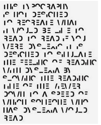
Know, first, I am not dyslexic. But I came to appreciate the problems readers with dyslexia face not long ago when I read about the work of UK graphic designer Daniel Britton. Britton created a typeface that is intended to recreate for non-dyslexic readers the frustration and embarrassment people with dyslexia experience when they attempt to read newspapers, books, and other literature most people are able to read every day of their lives. An example of simple text rendered in this typeface is shown below:
It’s not easy to read, is it?! You can read more about Britton and his work at the following sites:
http://danielbritton.info/195836/design
http://danielbritton.info/195836/2165784/design/dyslexia
His work also was discussed recently in this article on CNN:
http://www.cnn.com/2015/06/17/living/dyslexia-graphic-design-typeface-daniel-britton/index.html
By the way, Britton’s crowdfunding effort was successful, so we can expect to hear more from him in the future.
It was Britton’s work that inspired me to move forward with the creation of a special edition of The Hypnotist for readers with dyslexia.
The first thing I had to do was select the font I was going to use. Without boring you with the details, I’ll refer the interested reader, as my professors used to say, to the following blog I wrote, which should answer most of your questions (and then some):
https://www.goodreads.com/author/show/3251724.Theodore_Jerome_Cohen/blog
Suffice it to say, I selected OpenDyslexicAlta as my typeface of choice (the same one used in the version of The New Testament cited above). Frankly, the idea of using a typeface specifically designed for people with dyslexia appealed to me, and if it were to be free (‘open source’), so much the better. The Open Dyslexic typefaces fit the bill, here. Bottom heavy, with unique character shapes, help make it more difficult for the reader to confuse letters. You can read more here:
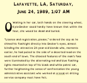
Once the font was selected, I quickly eliminated the text’s right justification, which I learned could confuse dyslexics, substituted OpenDyslexicAlta for the regular text’s Georgia typeface, adjusted the font size, and voila, that was it. Total elapsed time: about two hours.
Now it was just a matter of obtaining a new piece of royalty-free artwork and configuring a special front cover (another two hours), and it was completed…the new edition was ready for uploading to Amazon’s CreateSpace for approval.
By the way, I felt it only right to include the following statement on the book’s Amazon.com Web page:
“This special edition of The Hypnotist is printed using OpenDyslexicAlta developed by Abelardo (Abbie) Gonzale: “Your brain can sometimes do funny things to letters. OpenDyslexicAlta tries to help prevent some of these things from happening. Letters have heavy weighted bottoms to add a kind of ‘gravity’ to each letter, helping to keep your brain from rotating them around in ways that can make them look like other letters. Consistently weighted bottoms can also help reinforce the line of text. The unique shapes of each letter can help prevent flipping and swapping.” You can get a good idea what the print looks like by using the LookInside feature on this Web page. Will the use of OpenDyslexicAlta help everyone with dyslexia? No. Because the expression of dyslexia in an individual is as unique as the individual him- or herself, no guarantee can be made that the use of OpenDyslexicAlta will help any given person with readability. This special edition of The Hypnotist, however, is intended, at the least, to provide an option to those readers with dyslexia who might be helped when reading books printed using the OpenDyslexicAlta typeface.”
You’ll find the special edition of The Hypnotist for dyslexics here:
http://www.amazon.com/dp/1514789337
[NB: the LookInside feature may or may not be active when you read this; it often takes several days before the feature comes ‘live’.]
Importantly, CreateSpace’s editors approved the book within 12 hours of submittal (actually, overnight), so theoretically, what was conceived as a project over dinner with my wife and editor, Susan, could have resulted in the book being available for sale on Amazon.com the next morning. That I waited until I was able to review a proof copy of the paperback edition three days later is simply good practice. (CreateSpace also gave me the option of reviewing the interior and cover online, but you never know what the final product will look like until you hold it in your hand.)
So, to my question: Can print-on-demand publishing mean more books for readers with dyslexia? It can…if…IF…POD publishers, especially indie authors/publishers take the time to create special editions for the 20% of the population that would benefit from access to books tailored to their needs.
Editor’s note: the author welcomes your comments and feedback; you may reach him by e-mail through either of his Websites:
http://www.theodore-cohen-novels.com/bio-contact.html


